
Artist Research.
Colin Winterbottom.
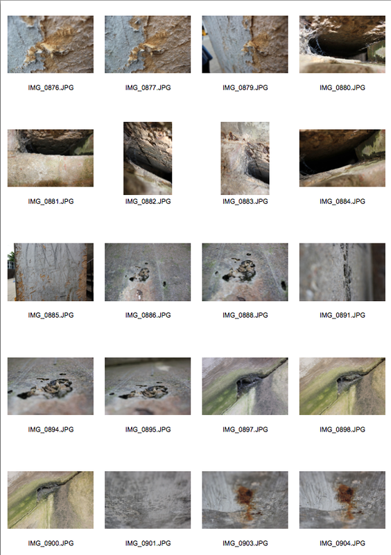
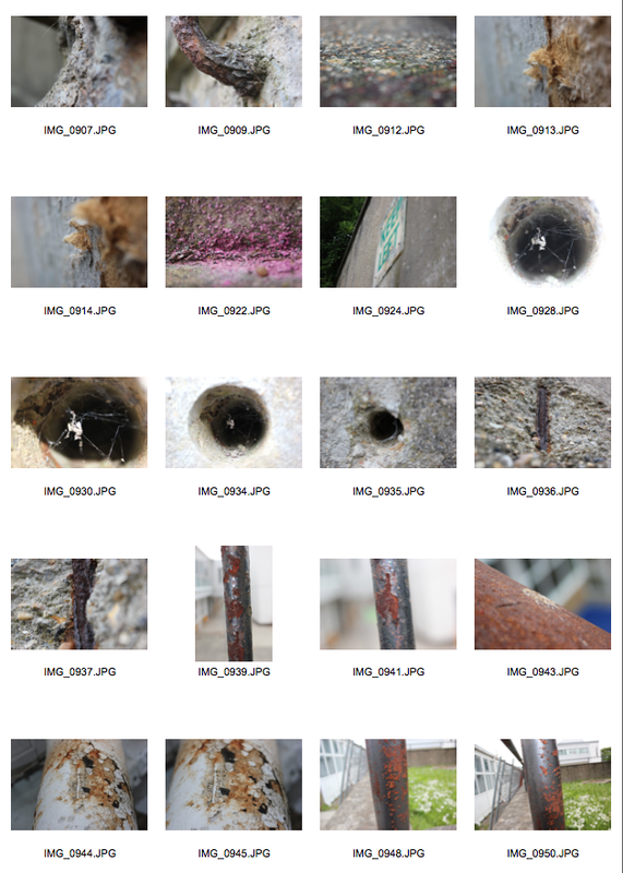
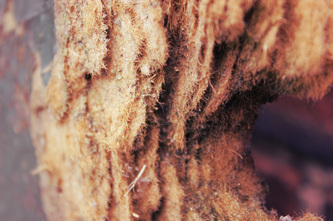
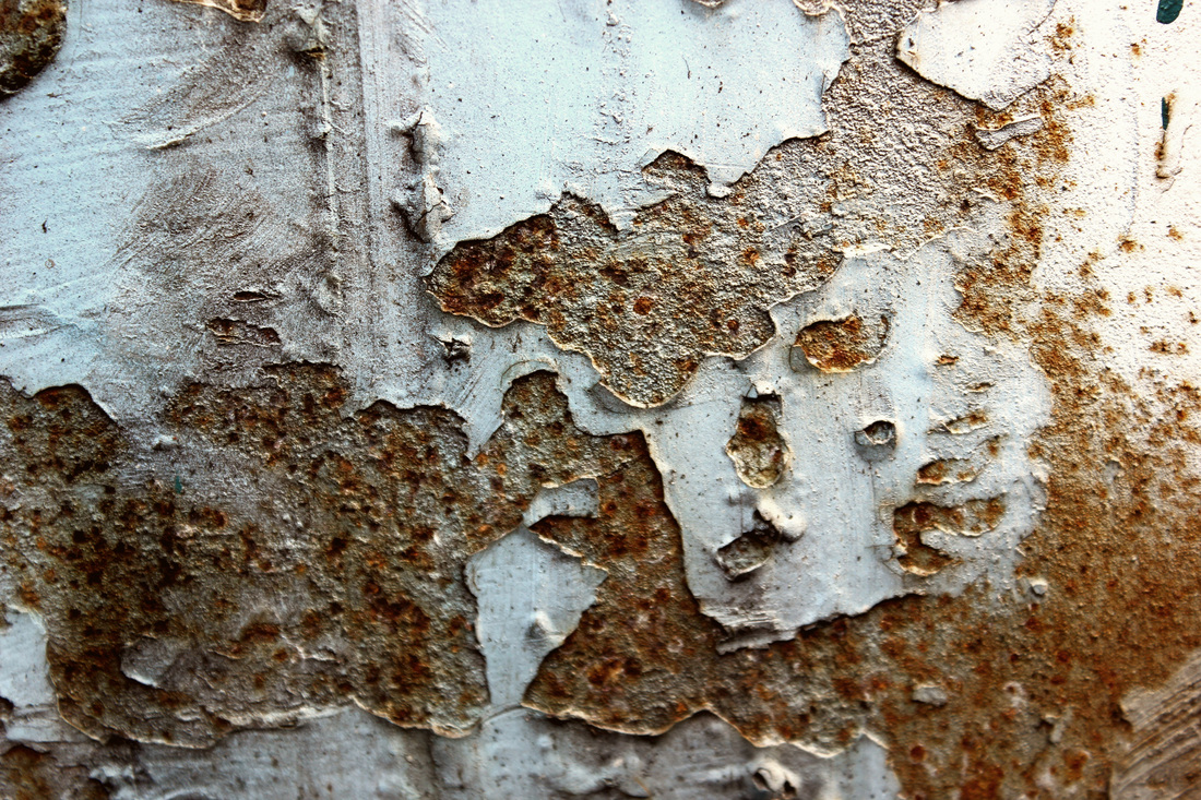
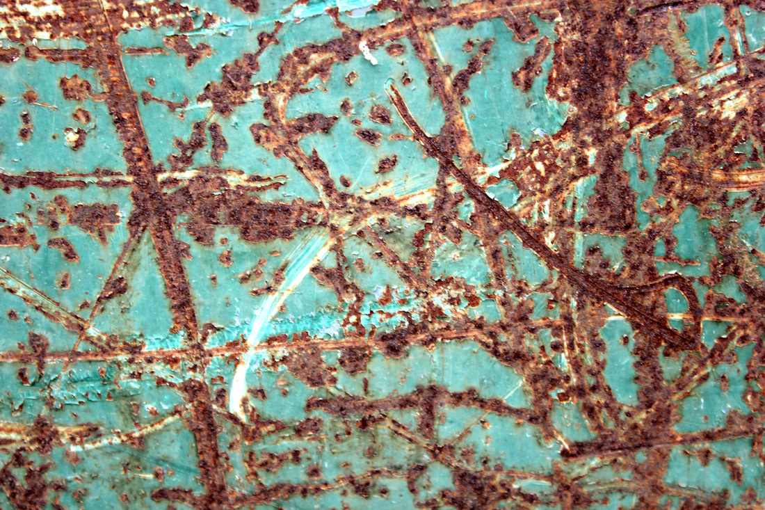
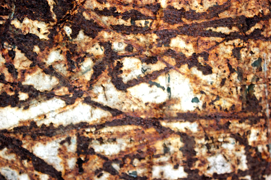
This new series is his first in colour & first to be shot entirely digitally -- it features macro studies of rusting and corroding objects. It makes a great counterpoint to his more traditional black and white work -- more abstract and full of saturated color. A common thread, however, is both bodies of work are influenced by a strong interest in lively textures, which these pictures certainly capture.
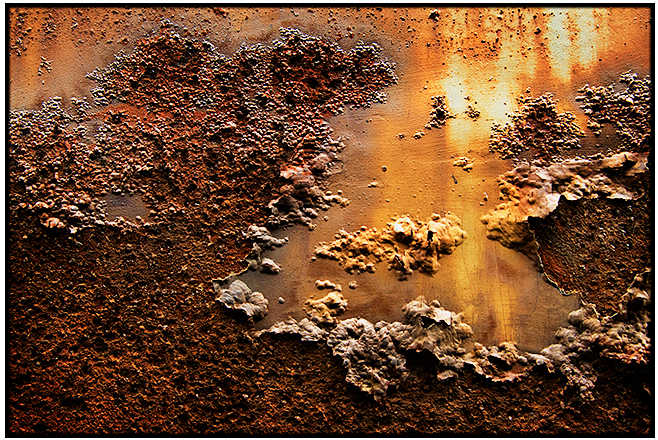

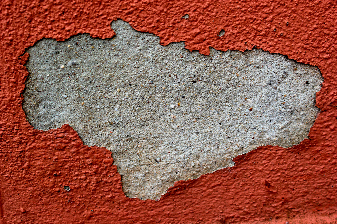
These photographs have been taken by Colin Winterbottom for his project 'Elegant Corrosion'. These photographs are close up abstraction shots of corrosion, or decay. Some of these photo's have of an element of layers peeling and revealing something new, and fresh. Others are more about patterns created, or the contrast of new and old, decaying and preserved. The title of the project is 'Elegant Corrosion'. This is important, as this work is showing a beautiful side to something normally considered an uncommon form of beauty. The colors, the highlights, the patterns, the complete abstractness of the art lets the viewer have an entire new perspective and changed opinion of
the objects. Its truly inspiring! I would like to take similar things, things that have been left behind and people think are no use anymore and find a way to make them seem beautiful, or 'Elegant' as Colin Winterbottom has done.
the objects. Its truly inspiring! I would like to take similar things, things that have been left behind and people think are no use anymore and find a way to make them seem beautiful, or 'Elegant' as Colin Winterbottom has done.
Favorite Photo.
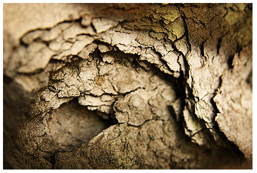
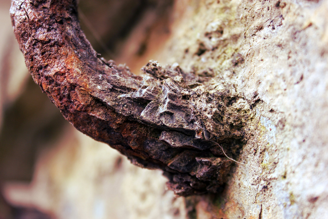
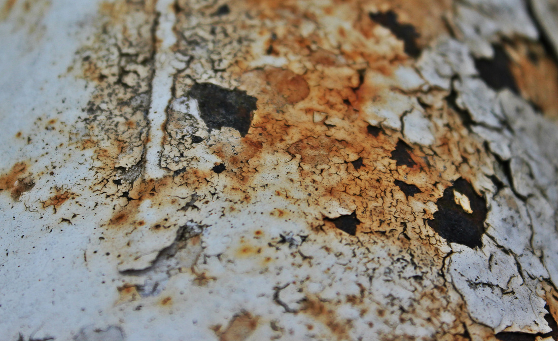
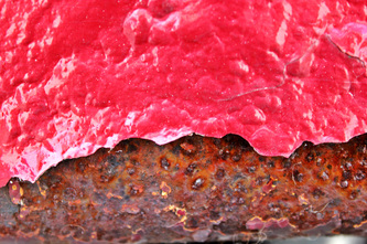
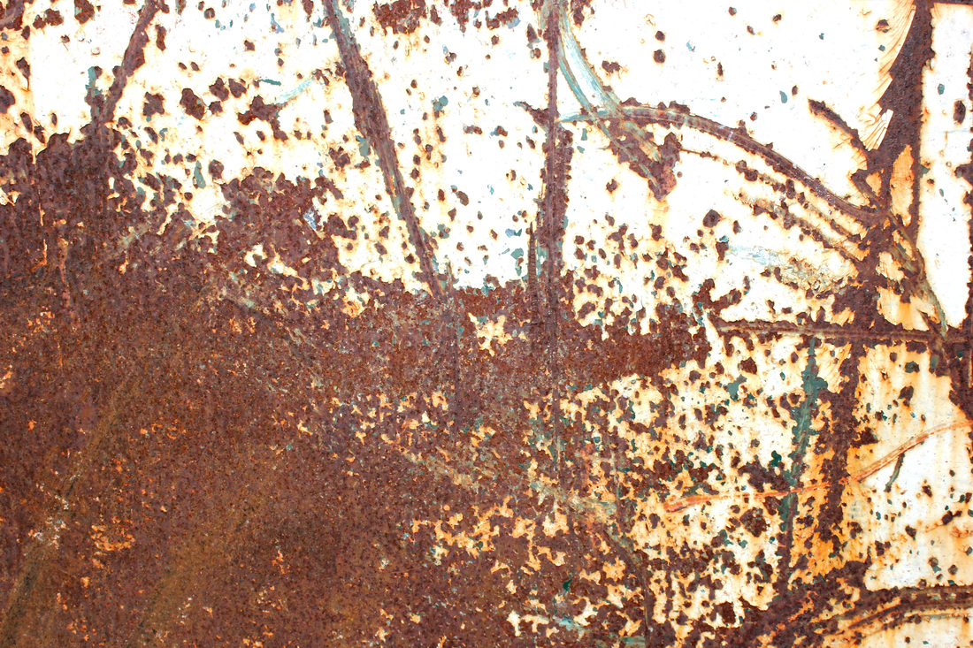
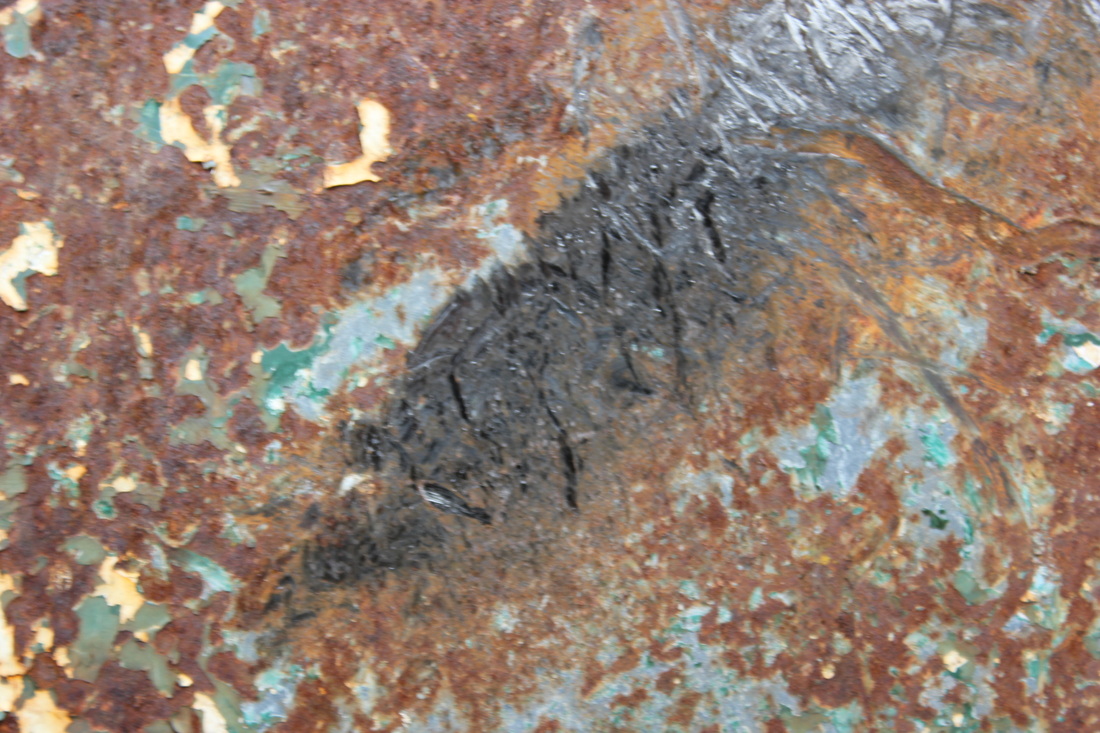
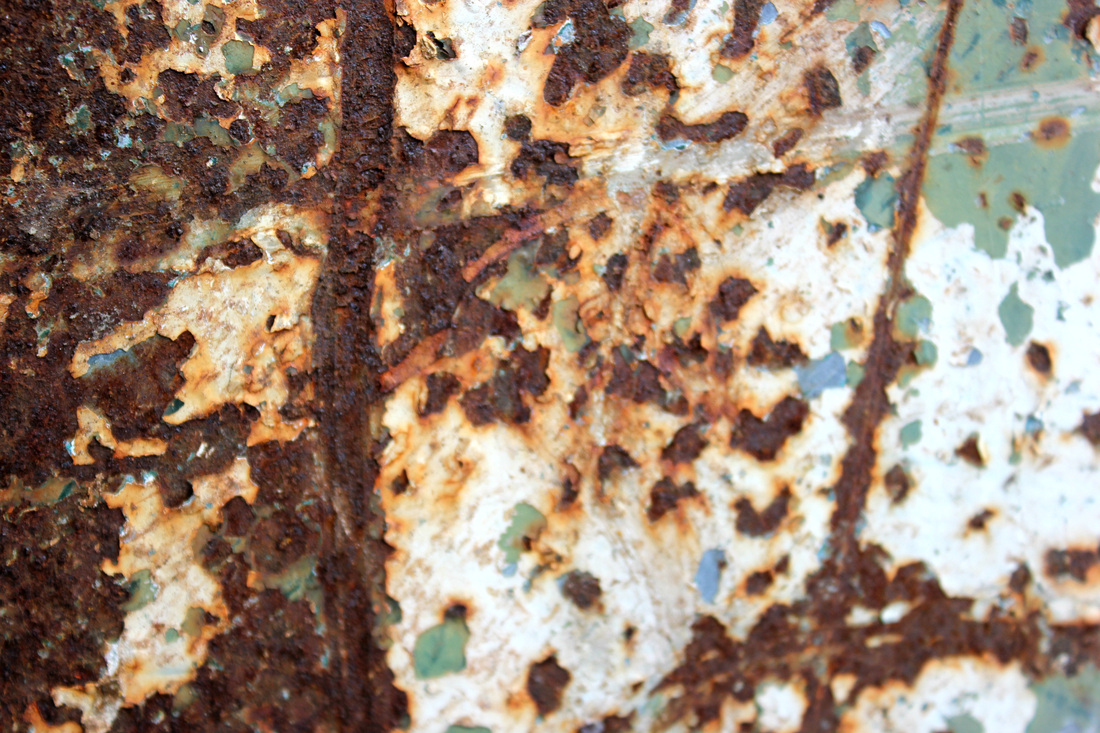
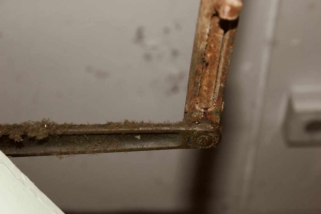
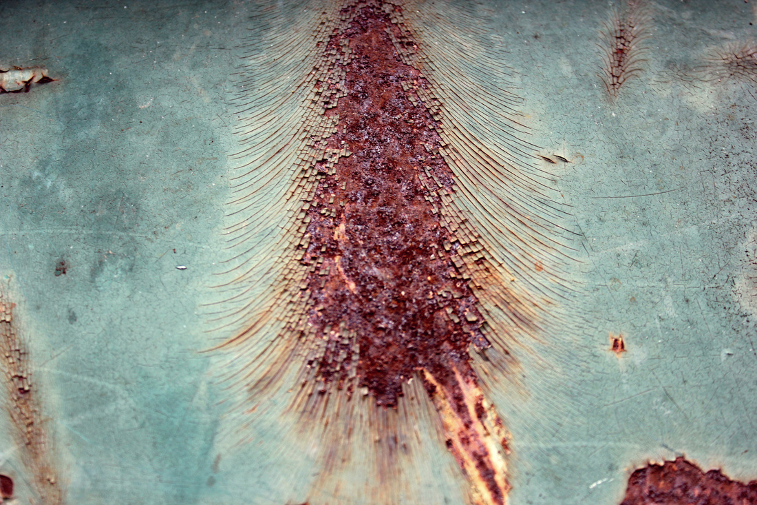
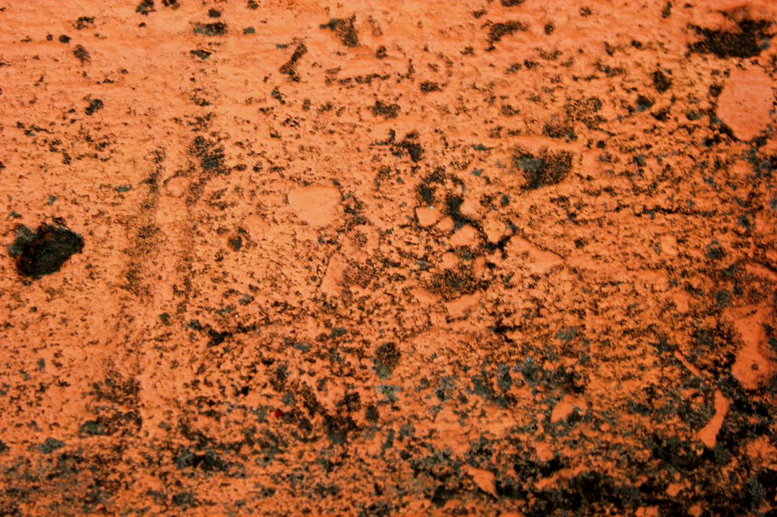
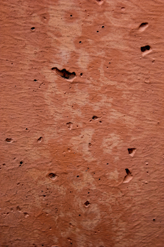
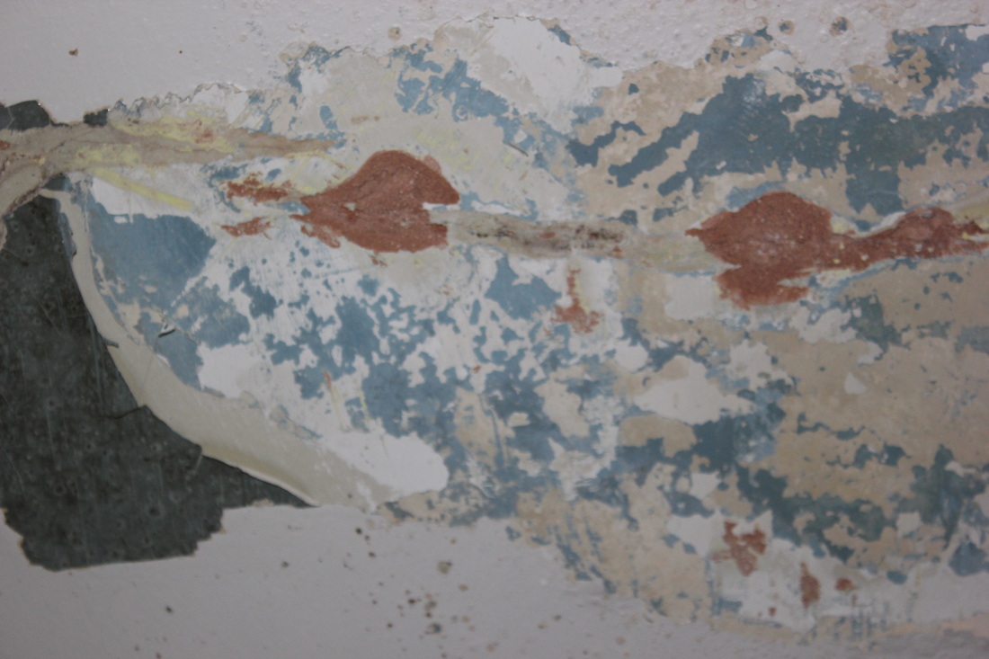
This picture is one of my favorite from this artist, as it is a combination of peeling and rust. Underneath the peeling of the paint, or material the colors are faded maroon, swirled with yellow and look like somebody has painted it. The whole picture is washed out, yet still has color which I find very interesting. This artist looks at a lot of pictures of rusts, and peeling pains and these tinging colors, a lot of things that have naturally created patterns. I think the photographer, by going close into the decaying object, is trying to show that there is more depth and beauty to things, if you just look at it from a different angle, in this case, so close that you cannot see what the original, now abstract, object is.
Comparisons.

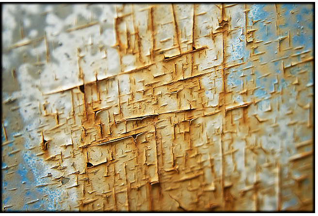
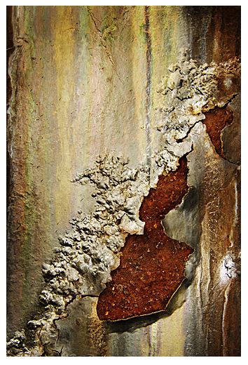
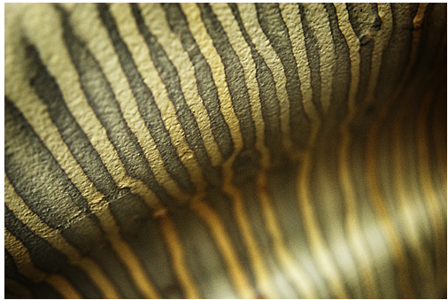
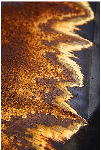
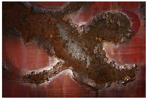
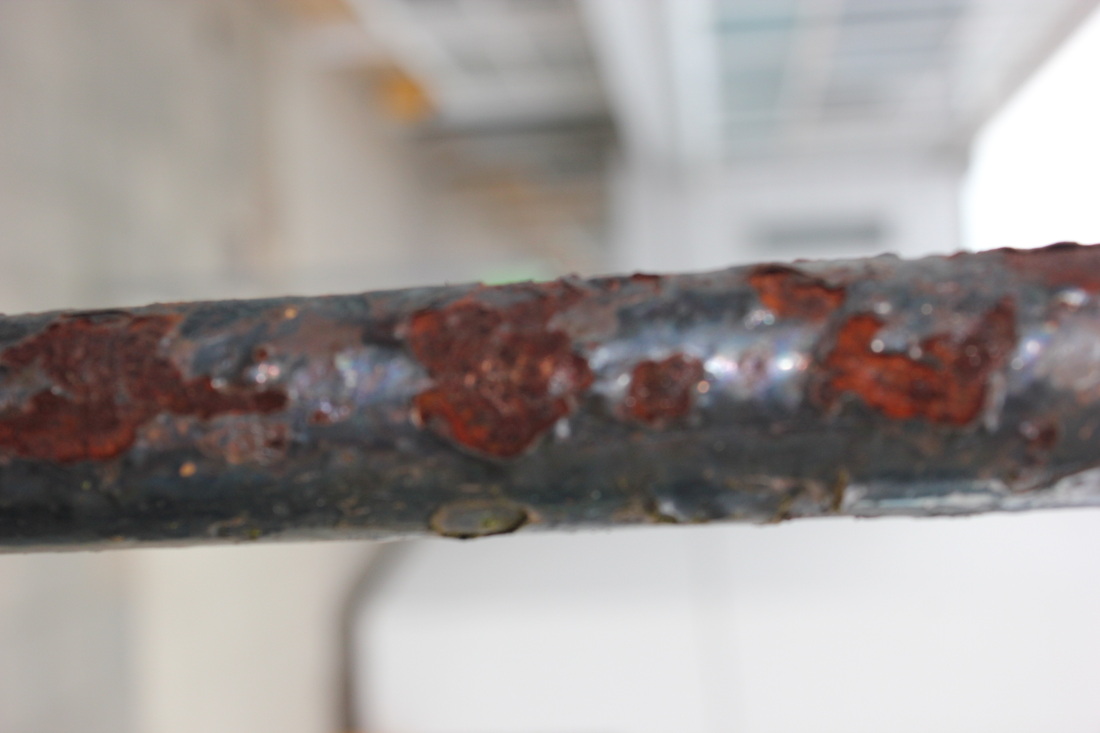
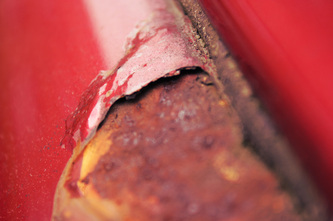
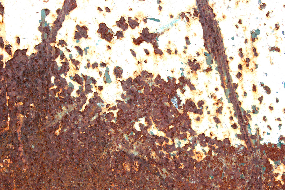
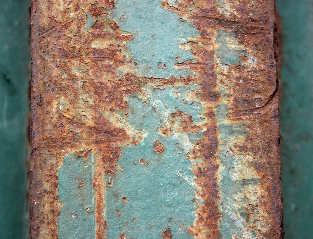
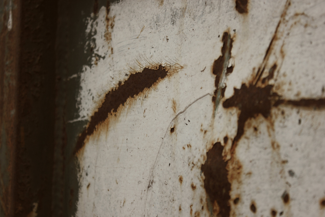
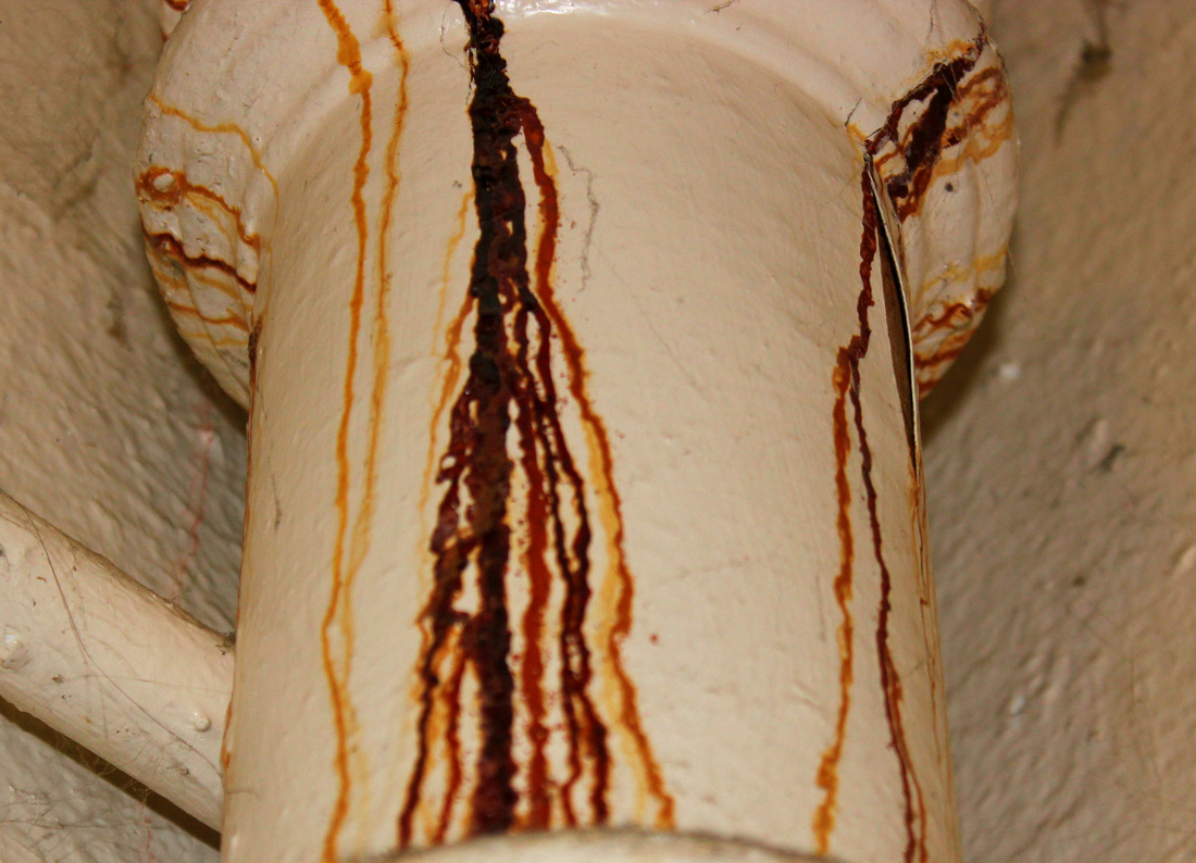
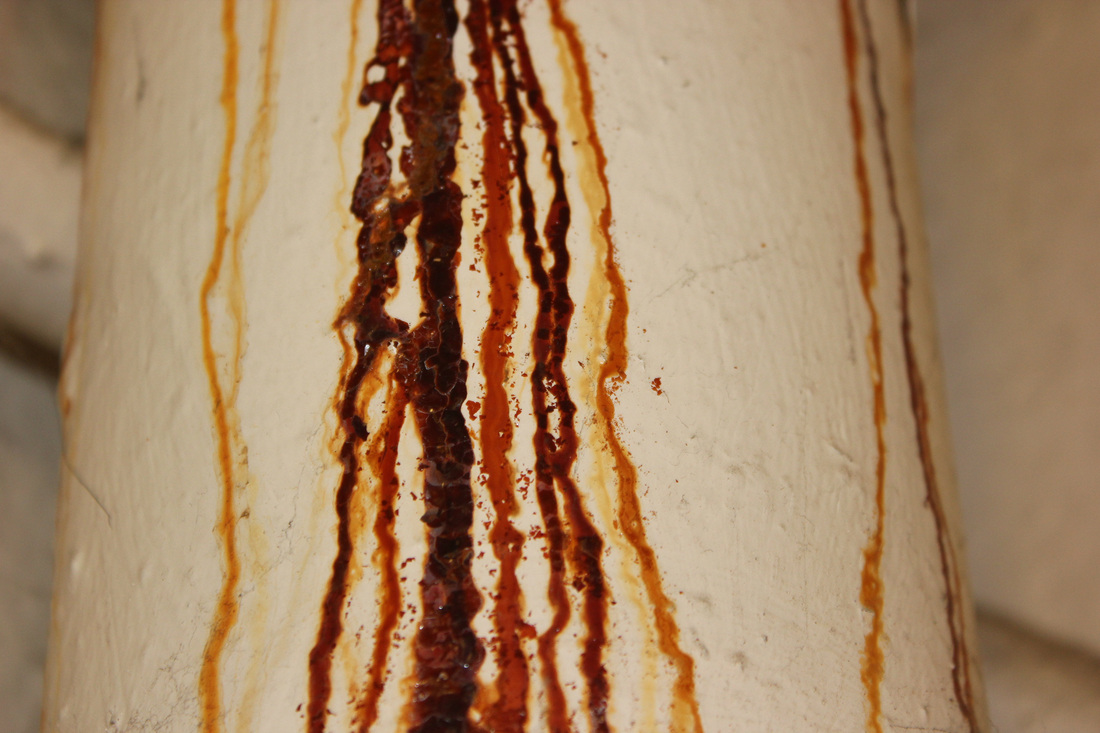
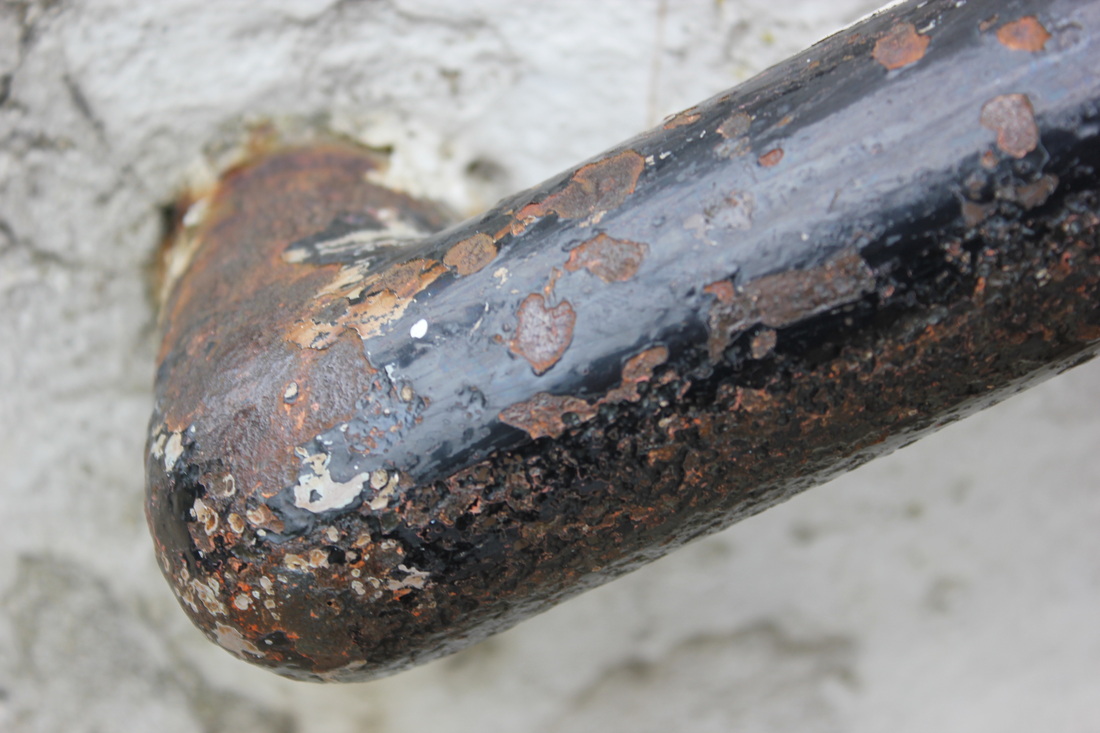
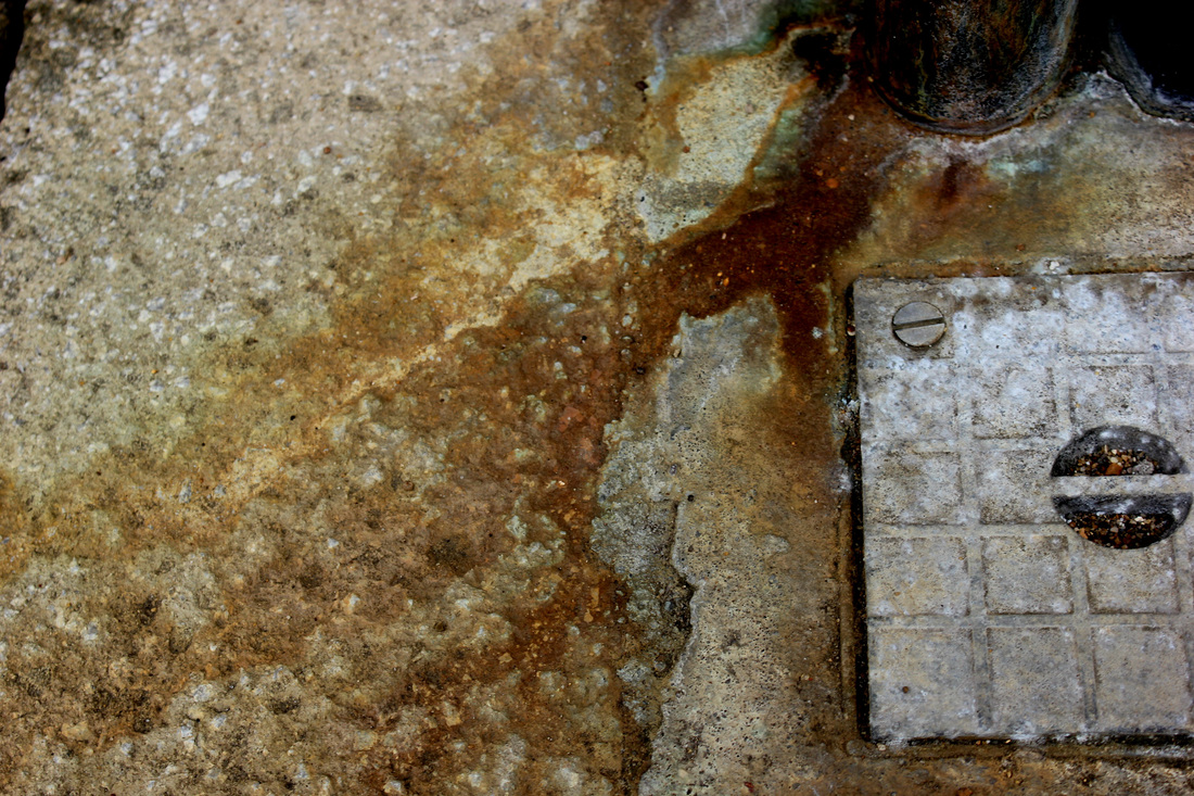
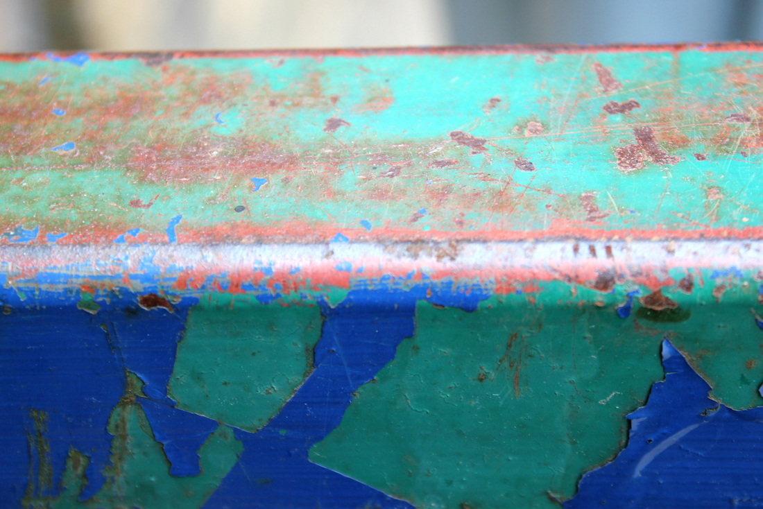
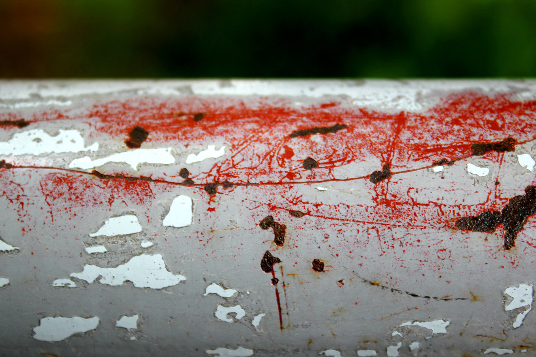
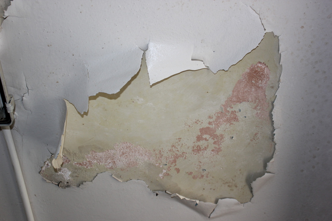
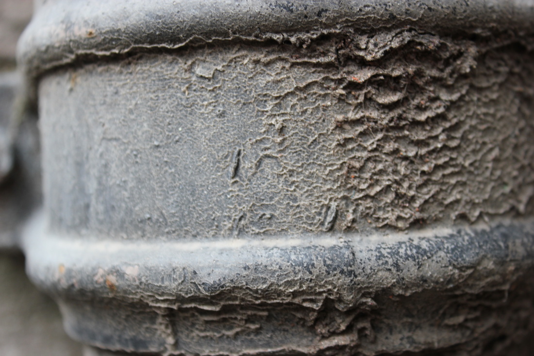
The sharpness of this photo adds to all the detail, the picture is filled with different textures such as the bubbling around the rust, the peeling of the off-white paint, the striped effect shown down the pole or post and the rust itself. This photo I do not think is as nice as the previous photo as it isn't as close up, meaning we can still sort of see what the object was- none the less it is still very nice as it contrasts well. The contrasting is of the rust and the clean white color in the remainder of the picture, drawing your attention to the redish-brown rust. The contrast in this picture is similar to one photo I took of my old car, below.

The contrast in my photo is like the photo above by Colin Winterbottom, as the two colors are separated distinctively.
My photo is bolder than the other I think, as the colors are stronger, but Colin's is more of a contrast as the colors are so different.
My photo is bolder than the other I think, as the colors are stronger, but Colin's is more of a contrast as the colors are so different.
First&Second response merged.
My first response closer...
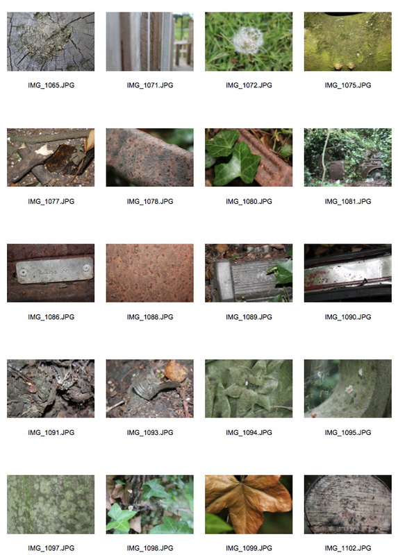
These photo's were taken in school, I used manual settings on my camera as my micro mode, or the flower symbol was not working. These have been chosen of the 100 I took to see more into what I did. This first photo shoot helped me decide on what I am going to look out for on my 'journey' next. Hopefully I will see some patterns, rusting, and that sort of thing.
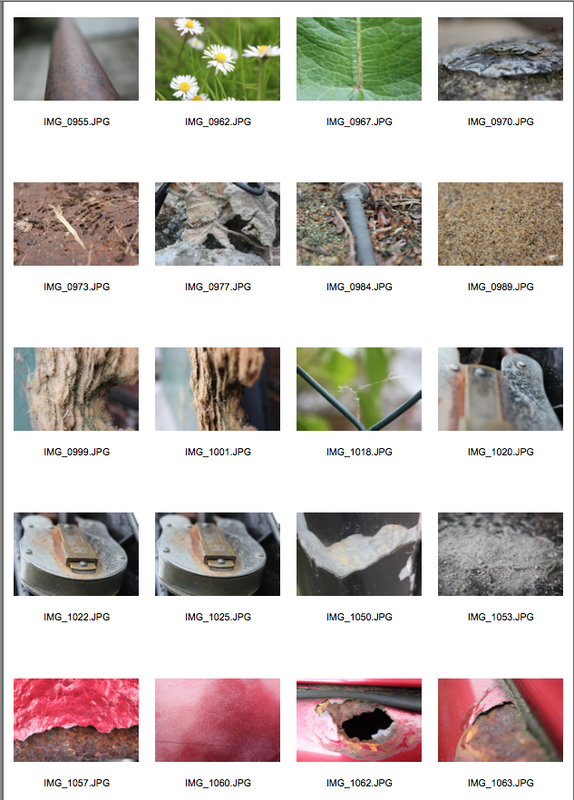
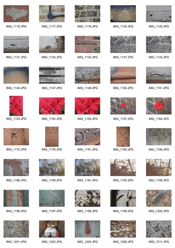
Chosen 10 Images from my second response.
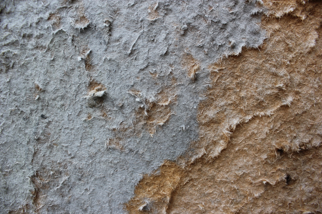
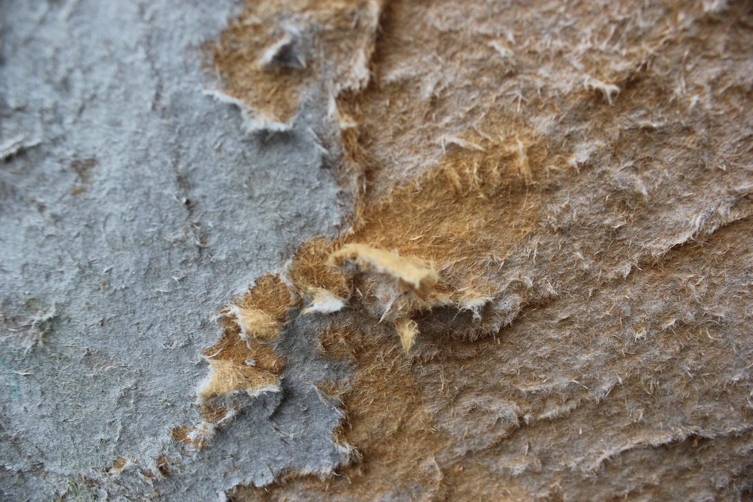
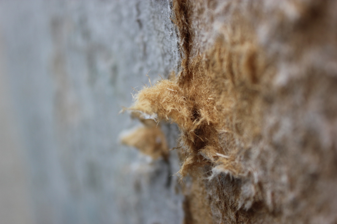
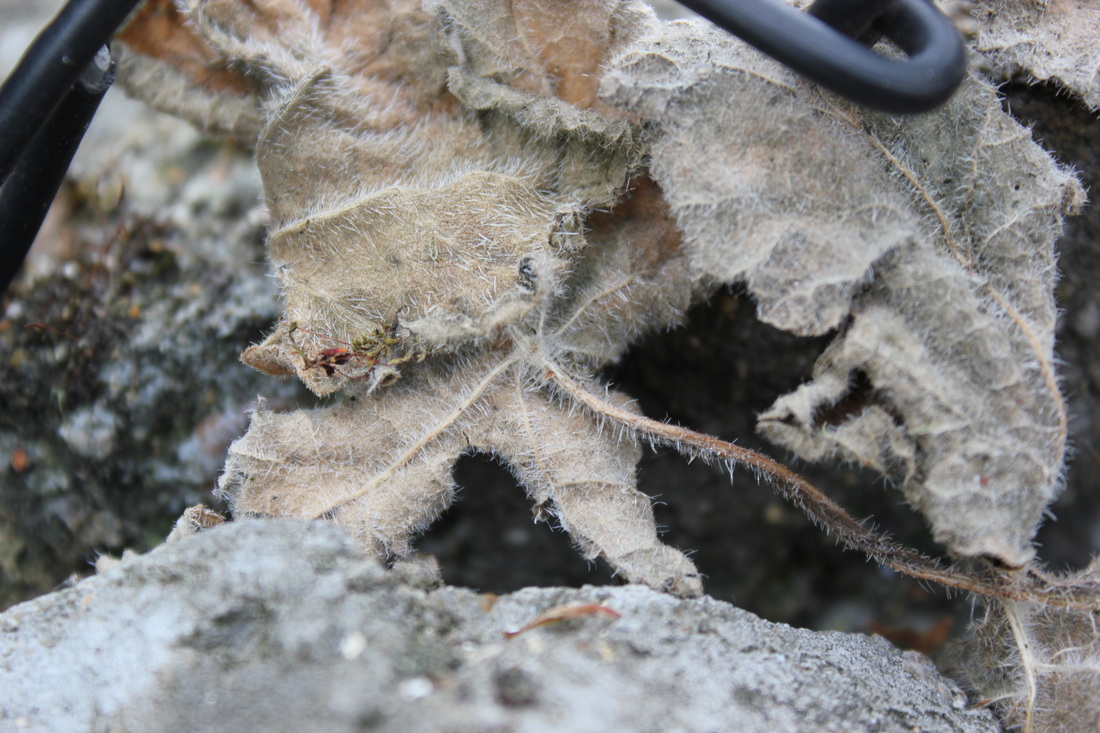
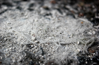
Fibre
Contrast
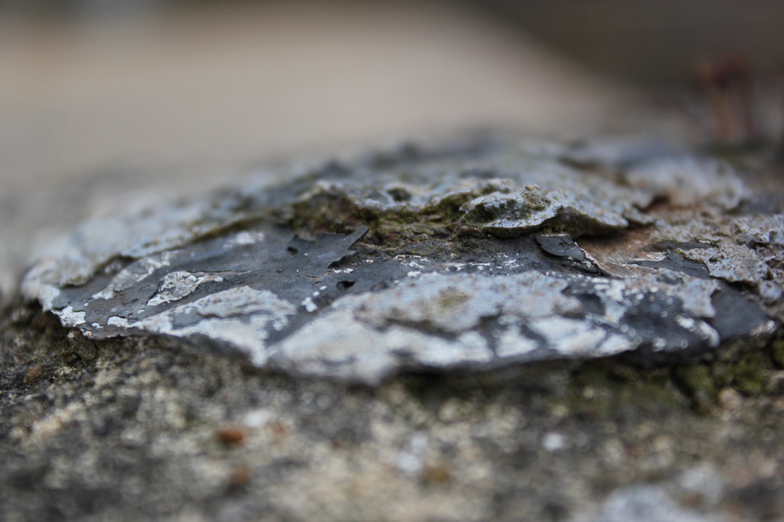
Rust
Rustic
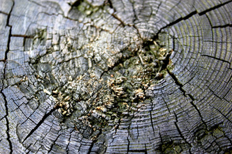
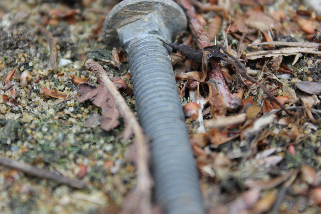
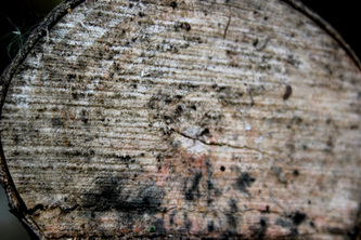
Tree
|
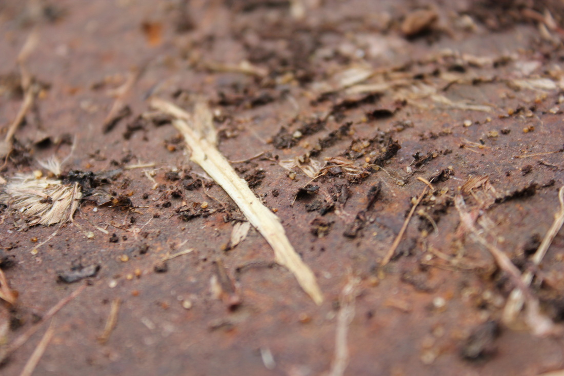
Crumbly

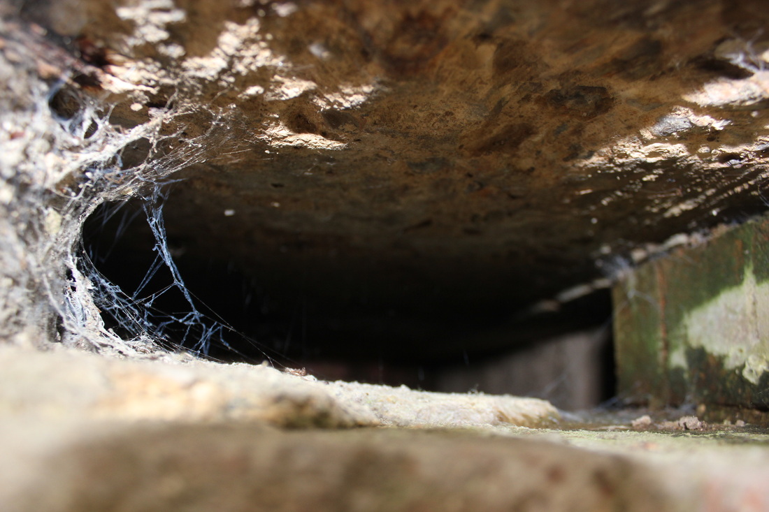
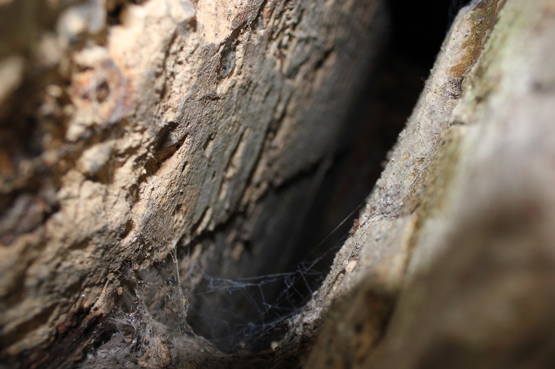
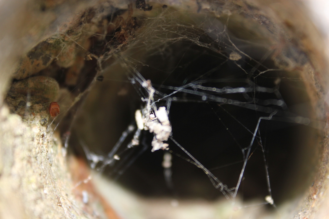
Webbed
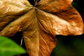
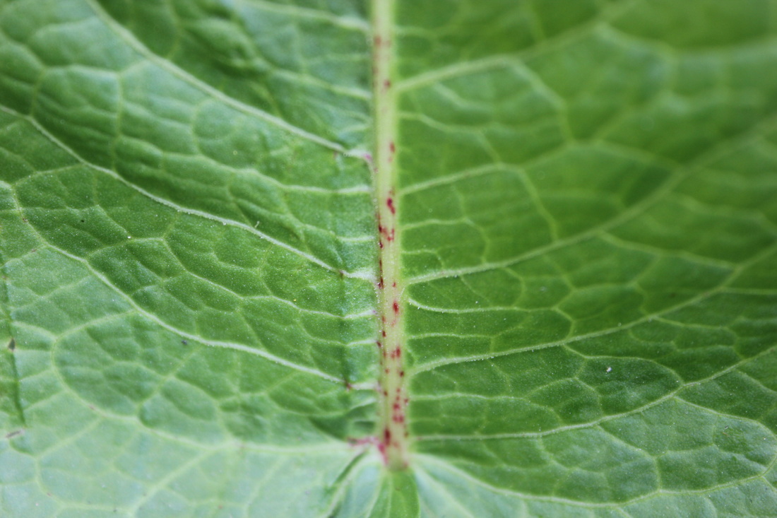
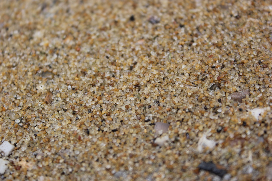
Nature
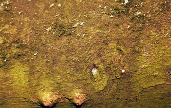
Green
Wood
|
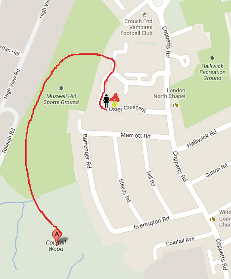
This is a map showing my journey to take these pictures...
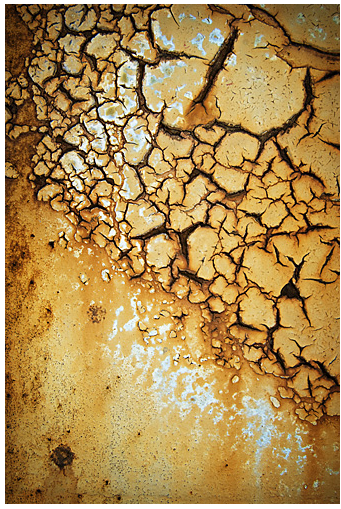
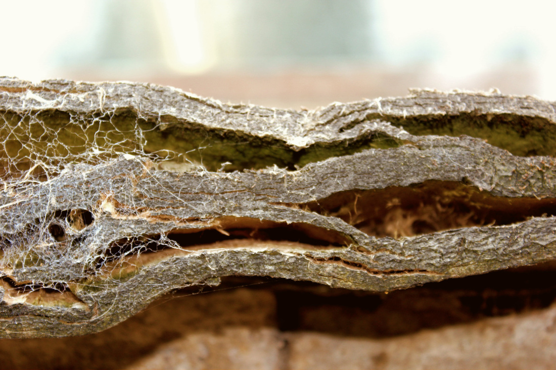
Pattern/Webbed
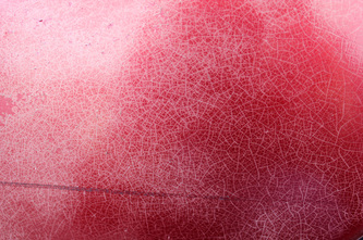
This picture was taken of paint cracking, causing It to leave a pattern resembling webbing. I chose this picture to develop my project because I think it has captured, exactly how I wanted to, patterns in the 'Elegant Corrosion', Colin Winterbottom sort of way.
Rust

This picture was taken on a piece of an old car I found in the woods that has been left to rust over. This is a little bit left of what you can see that isn't overgrown. I like this picture because I feel like there is a story behind it, It is the only left bit on the car that is identifiable and may mean something to someone. I like that mystery element of it, also I think it portrays nicely how I want to develop my project into rusting objects, as the colors and textures are of course old and rusty, but in a way; beautiful.
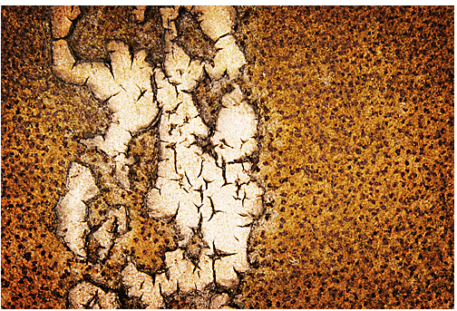
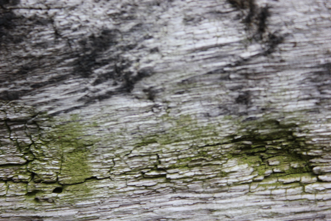
Color/Contrast

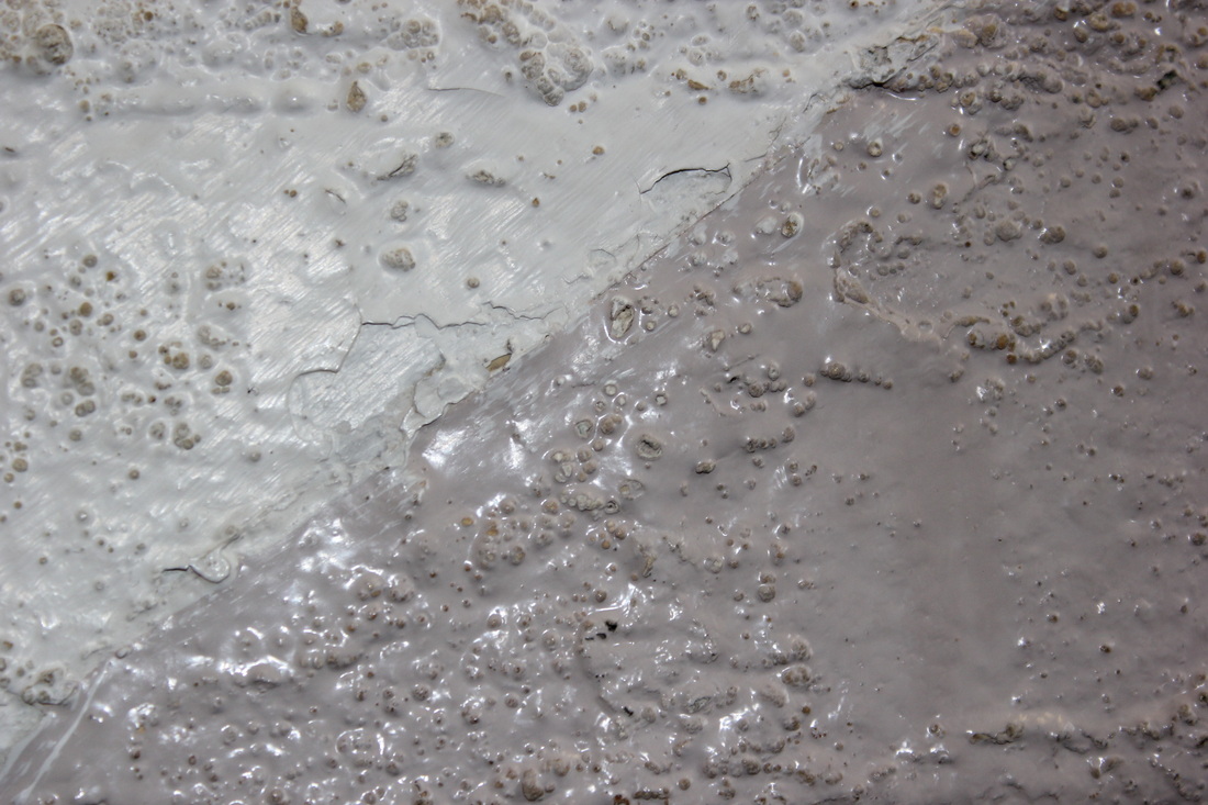
This picture was taken of the same old car as the first chosen image, but a different section. I love this picture as I am a fan of color in my pictures. This photograph has the bubbling red of the metal, reflecting like its new on half of it, then the chipped away half reveals a dull, rusted area. The rust, and the bubbling the way it catches the light adds depth, and texture to the photo. I chose this as one of my further development photographs to show the contrast in objects I am looking for, as well as textures and boldness.
Development...
From my shoot of roughly 100 pictures, I have chosen 3 semi-final images to develop my project further. The three things I will be looking out for are contrast, rust and patterns. I will be going to an old junk yard to look for places things may have been left behind, rusted, and broken causing all of those three things.
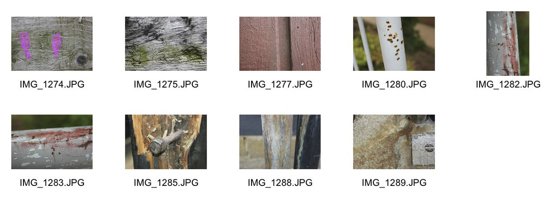
School photos.
These photo's were taken in school grounds, i have kept my eye out for my three key pictures/words.
Developed from my 3 images...
RUST:

Favourites:
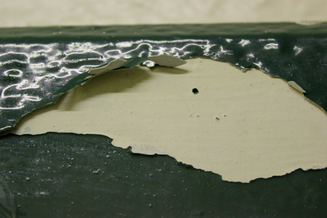
This picture is of the side of a skip. The paint has chipped away and cracked due to weather, and just being generally old. I like the contrast of the colour of the rust, and the washed away green paint. The green background paint is faded which makes the rusting section pop out, and become the centre of the picture. Around the rusting bit, the paint is fraying off and cracking, this creates a nice texture and pattern.

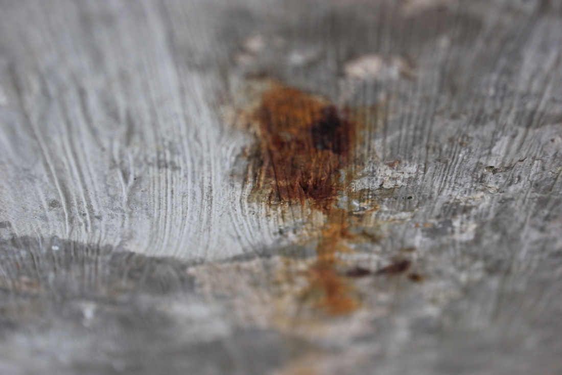
In the picture the colours go from light do dark, caramely colours. The offset waffle like shape adds depth to the picture as it does not fully show it. I like the unbalancedness of the picture, as it makes it more interesting rather than being set in the middle taking up the focus of the picture so you can look at the rest. Although the picture is of the rusting ground I still think the browny caramel colours add warmth and a sort beauty to it. The picture has a man vs nature element to it as a manmade thing has been broken down into rusting and decay- showing the the power and beauty of nature.
Color/Contrast.


Favourites
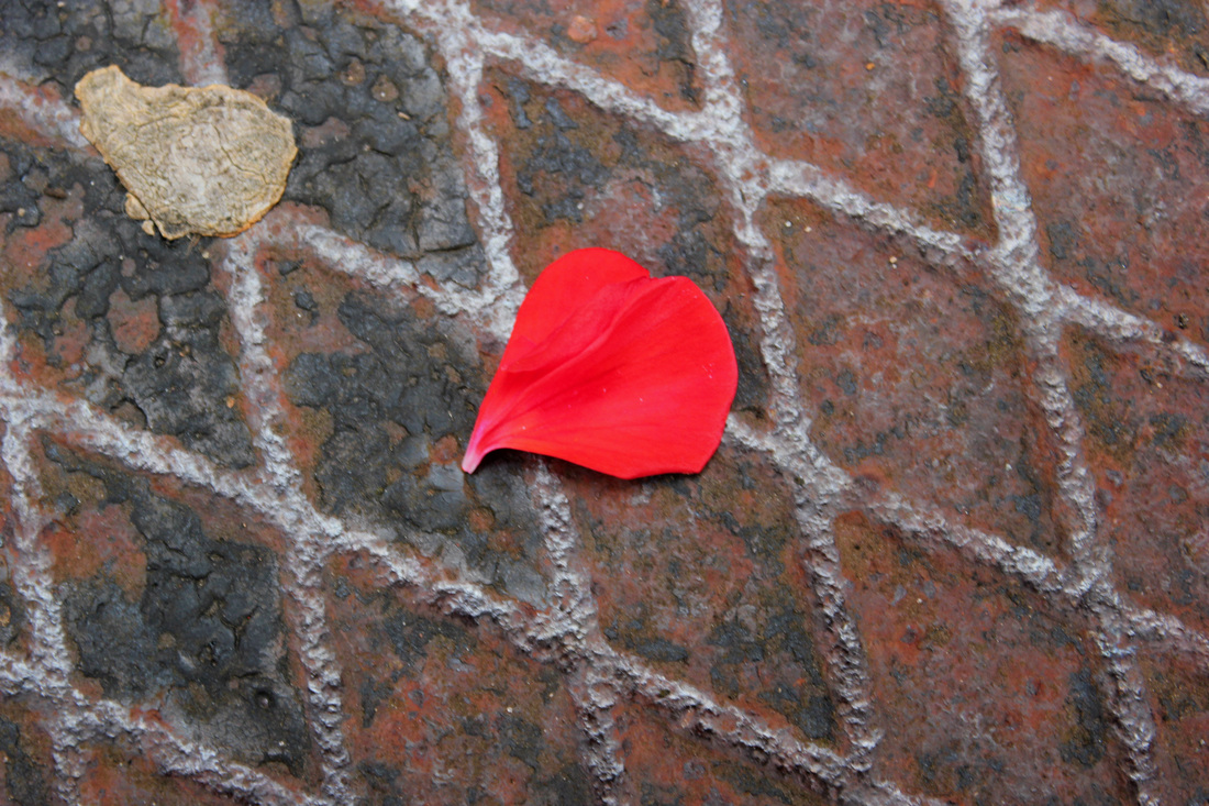
This image was taken of a petal of a plant on a rusting metal man hole cover. The patterns in the picture caused by the cris-crossing of the lines add detail to it. I like how the petal is so bold, and simple because it contrasts nicely to the busy background. The petal is very crisp and new, layered onto the old rusting metal background and adds a further element of contrast to the image. the colours are also contrasting, the red of the flower reflects the reds in the rust and work together well.
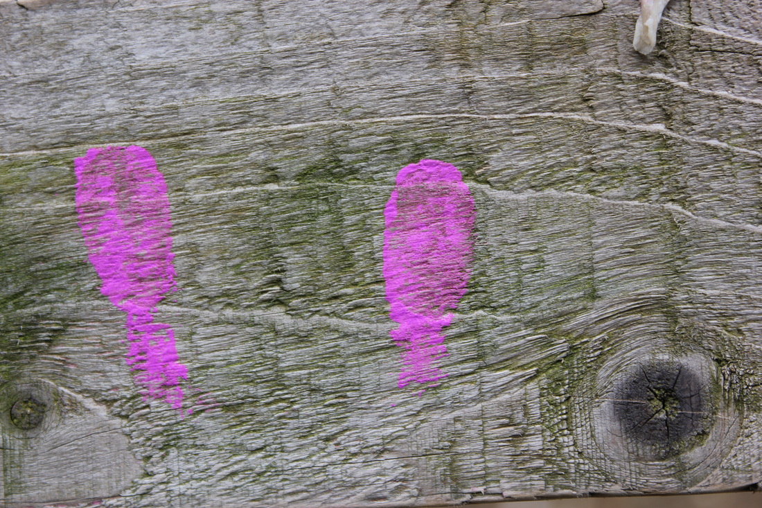
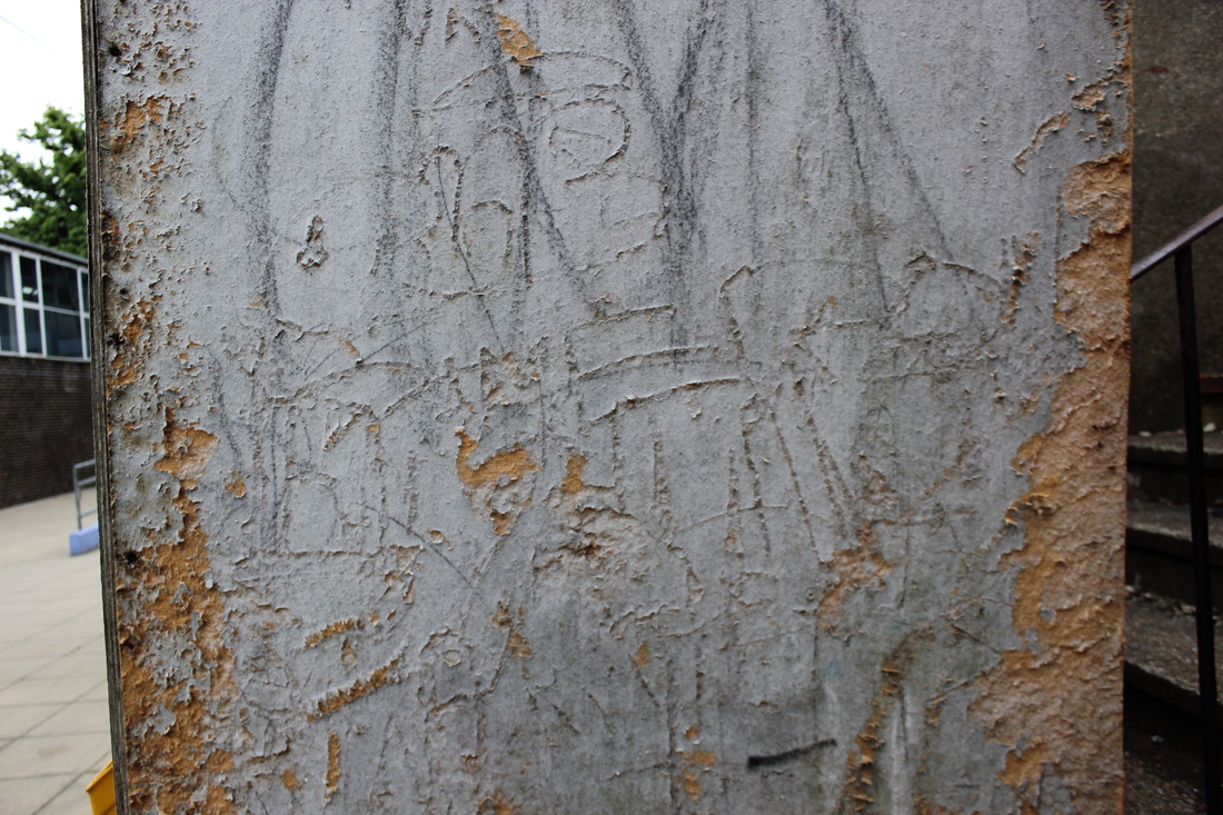
This picture is of grey-ish wood, with bold fingerprints of paint left on it. The grains of the wood add a detailed pattern and texture to the photo that I like. The bold coloured fingerprints left on the wood add the contrast to the picture, of bright colour to dull, and manmade to natural- having the element of man vs nature again. You can see the patterns through the paint, which I think shows in the picture that man made things can never truely cover natural things, as in the layering the texture is still clear.

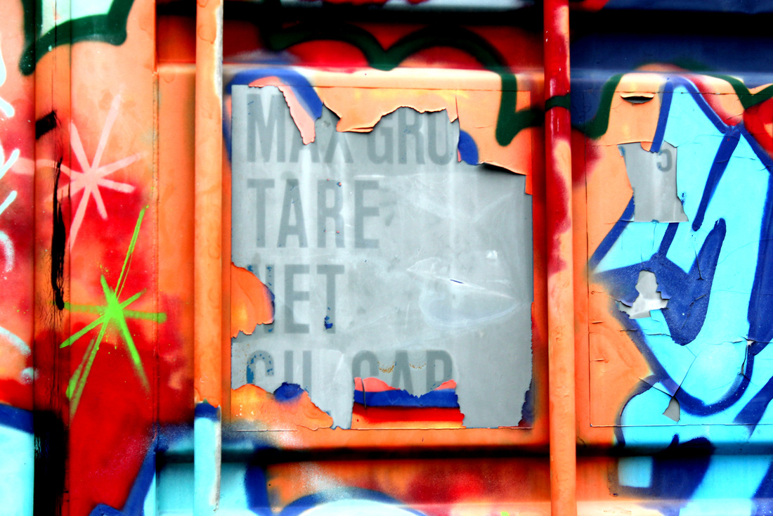
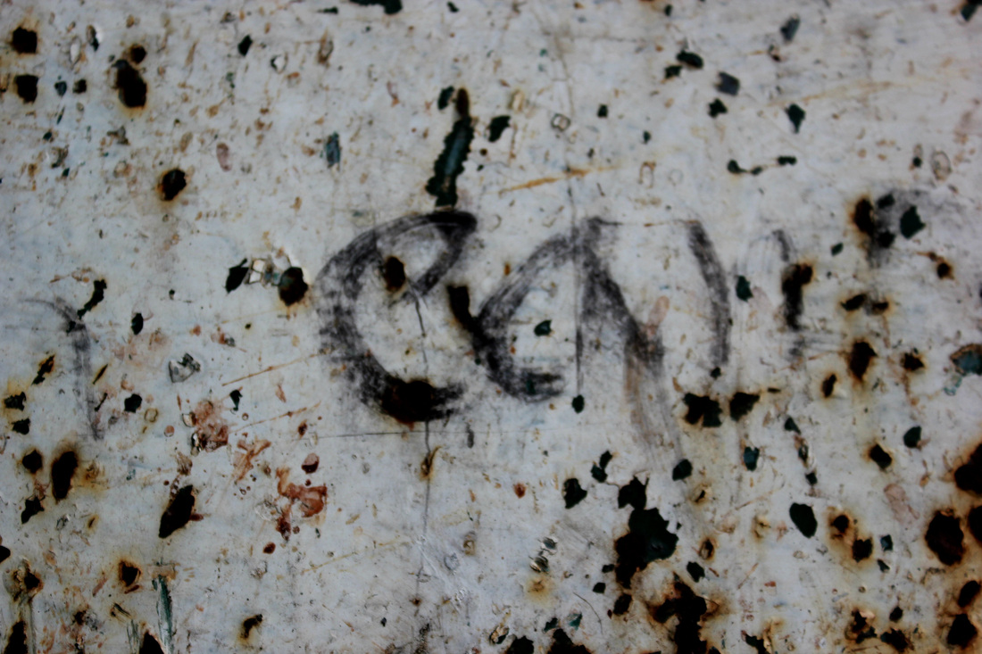
This picture was taken metal that has been graffitied in bright colours. The colours are very bold, but the paint chips away to black and white serious looking writing. This picture contrasts in two ways, the gripping colours to the black and white inside, and the playfulness of the colours and patterns to the plain, standard writing on the inside. I chose this as one of my favourite contrasting pictures as I think it represents well colour, as well as contrast.
Patterns/Textures


Favourites

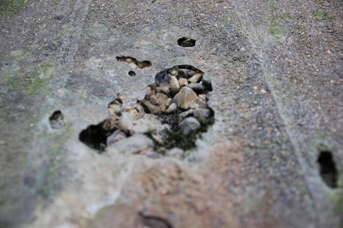
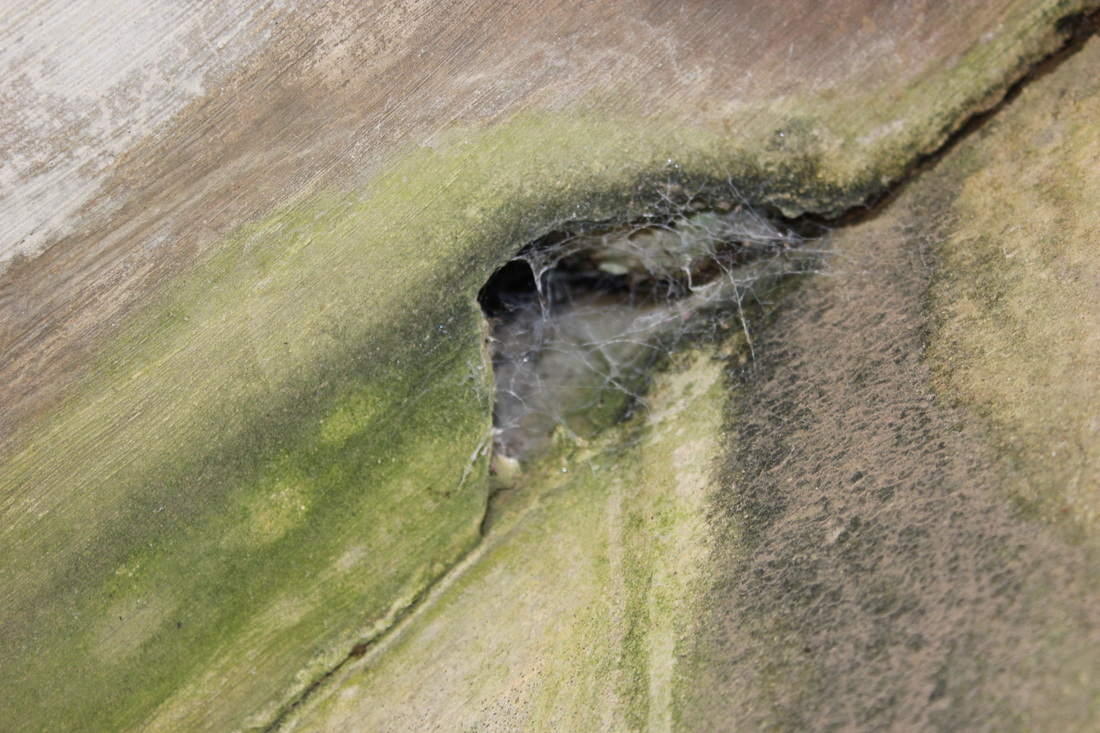
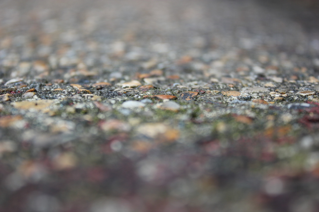
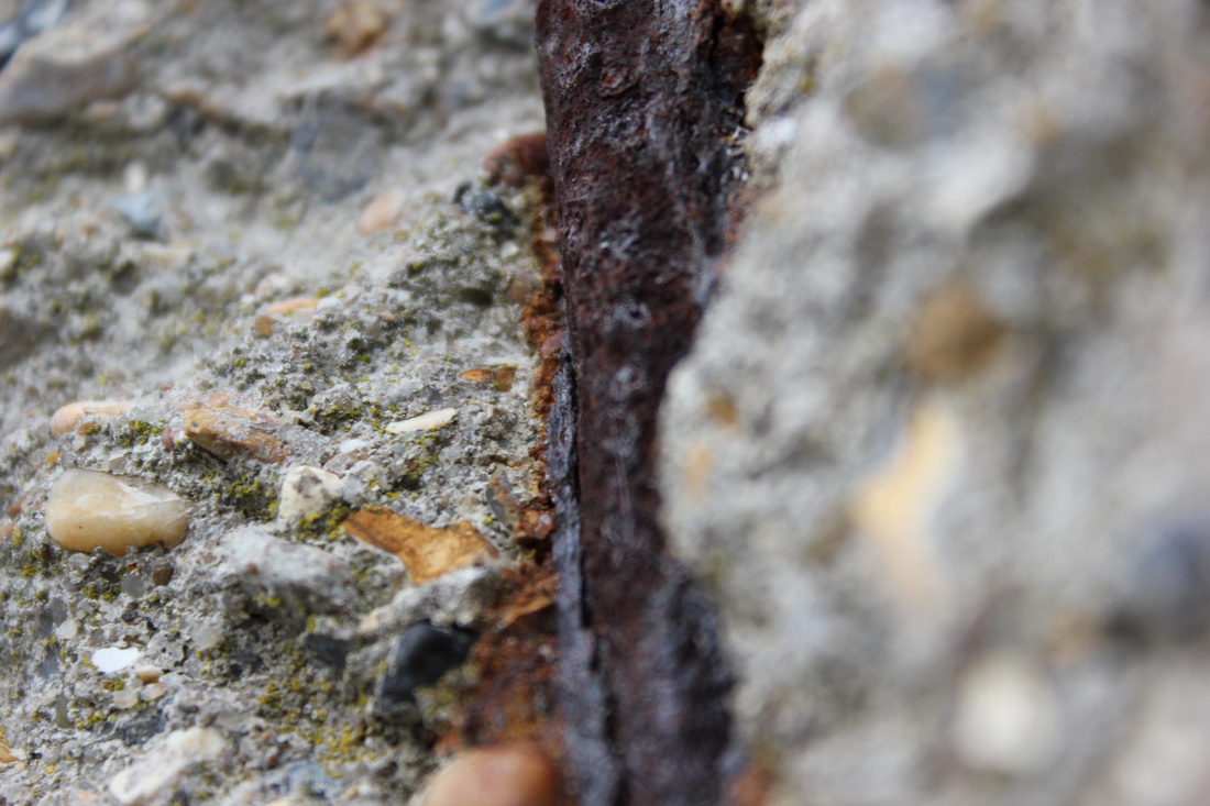
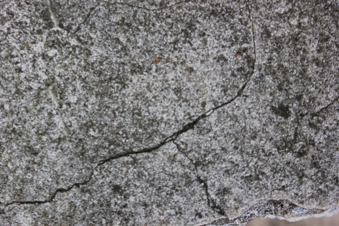
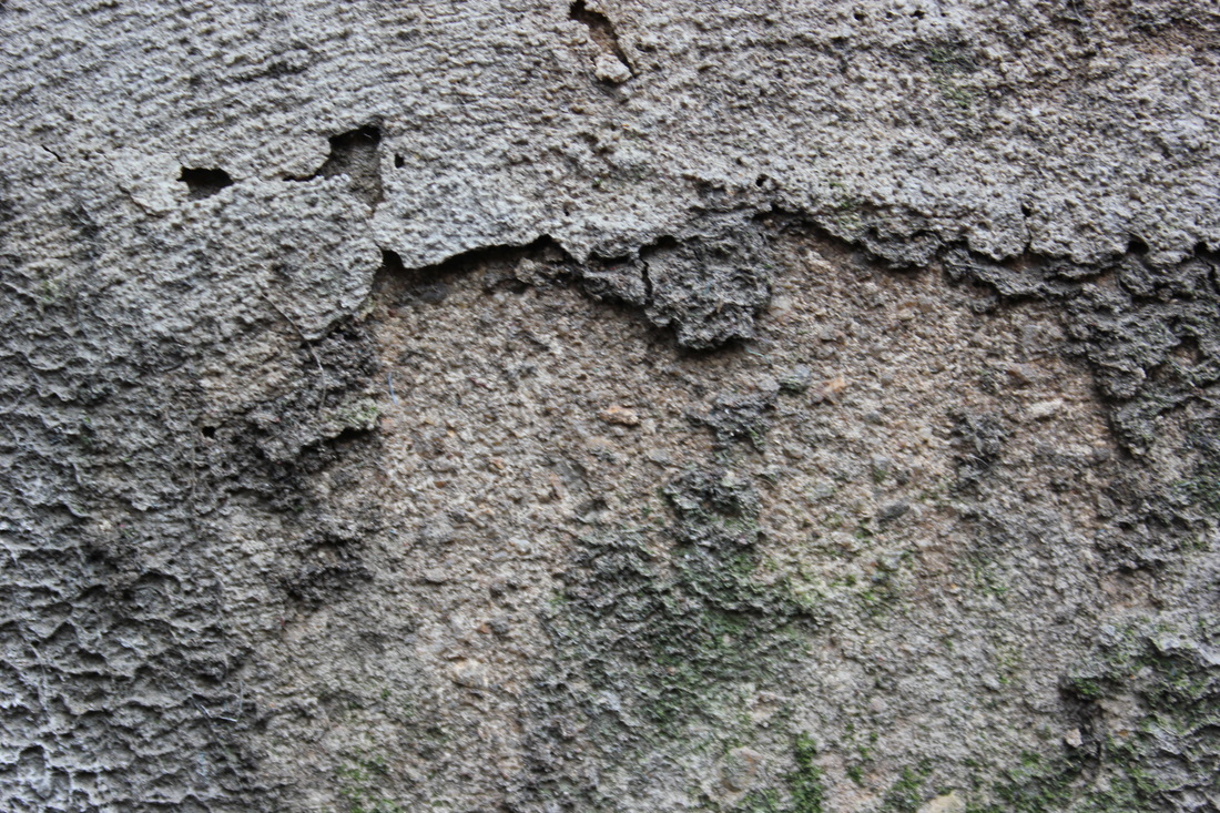
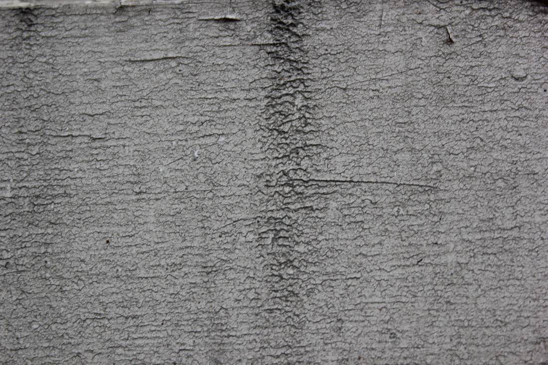
This picture is of a concrete wall. The pattern created in this picture with the crests, add depth to the image as the light catches certain aspects. The image is made up of crests or 'craters', this gives an impression of the moons surface, which makes you think of another world, not quite like ours where things are different. This close up, abstract shot, of something normally you would turn a blind eye too, gives a sight into things you normally miss, to show how they are interesting and can be perceved in a new, more interesting way.
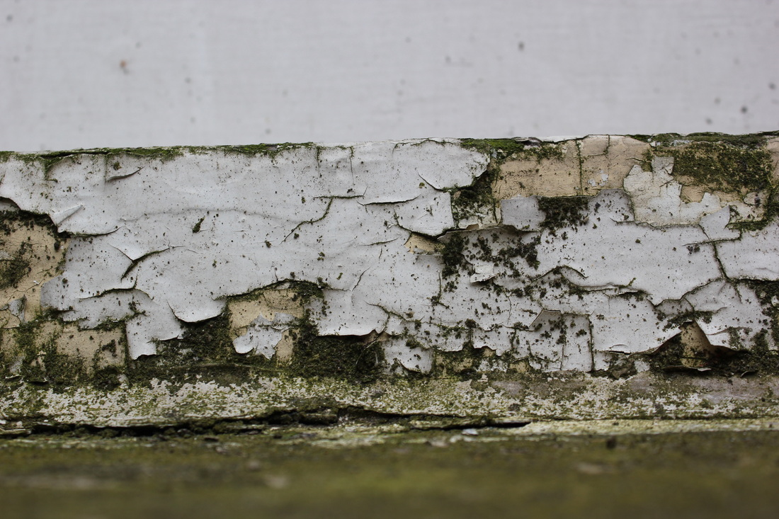
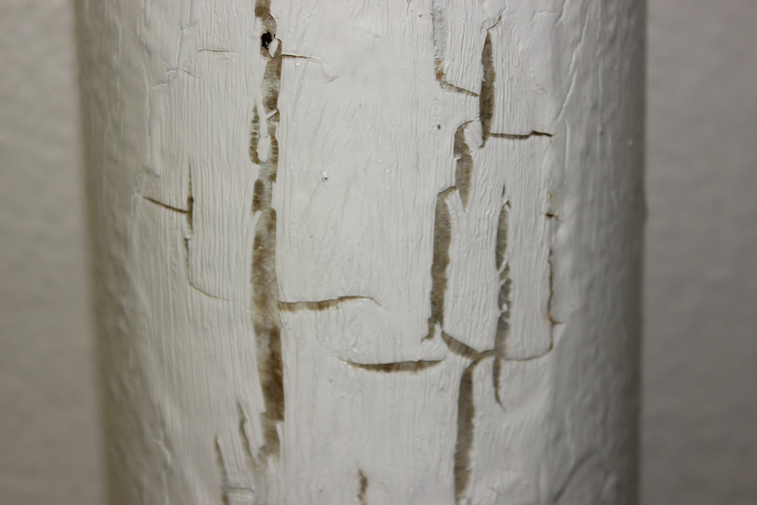
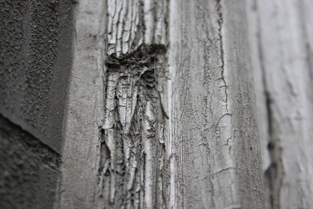
This picture is of a window-cil painted white originally. Starting off crisp, white and slowly becoming moulded and crached. The paint is chipped and cracked, this leaves a pattern, and texture familiarised with age and decay. The mould adds colour to the picture, and reminds us that the cause of the decay is natural- having the man vs nature aspect in the photo. The top of the picture is white, and barely touched, and the bottom is green. Both of these are out of focus, this shows that they are unimportant in the image, but still there. In the middle, focused in the photo there is the joining of the two parts of the image, like a battle of the two sides.
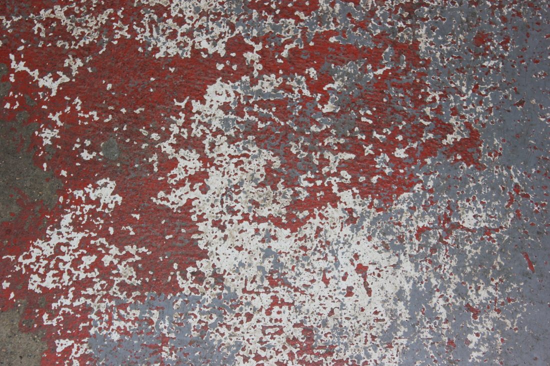
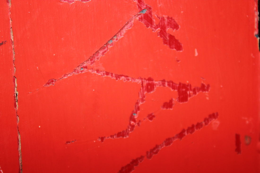
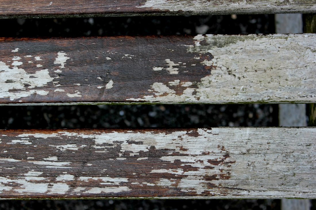
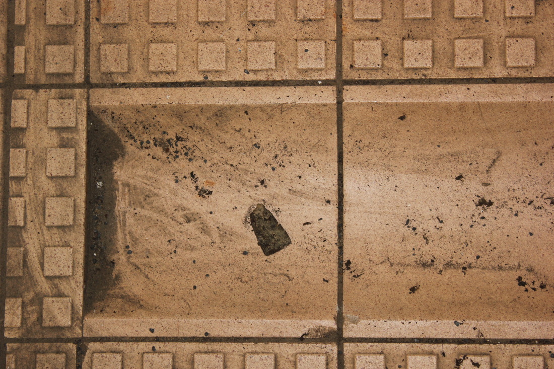
This photograph is of an old, painted floor wearing away. The pattern left behind has two contrasting colours, white and red. The floor has been walked all over a lot, normally going un-noticed. This picture is interesting because its taking something bigger, and looking at it closer till you get abstract patterns and it isn't very recognisable anymore. The floor is walked on a lot, and getting worn away, the red could symbolise blood and how its coming to an end. The layers show how things get covered up, so if something is getting old like a floor its going to get covered up. I think taking a picture in closer shows there can be more depth to it.
